What Does the Starbucks Logo Mean?
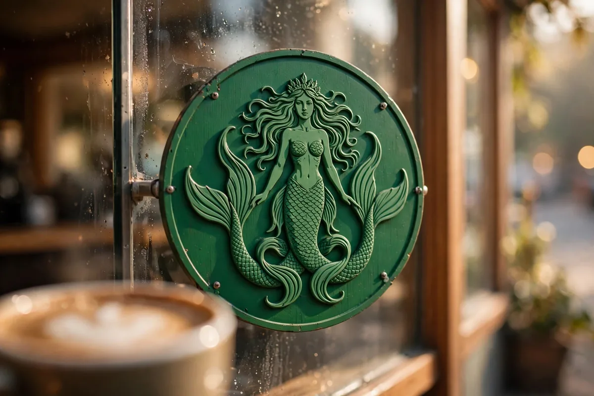
The Starbucks logo meaning is seduction: she’s a twin-tailed siren from Greek mythology, first drawn from a 16th-century Norse woodcut when the company opened in Seattle in 1971. The founders chose her because coffee, like a siren’s song, is irresistible. Today the green siren stands alone as one of the most recognized brand marks on earth.
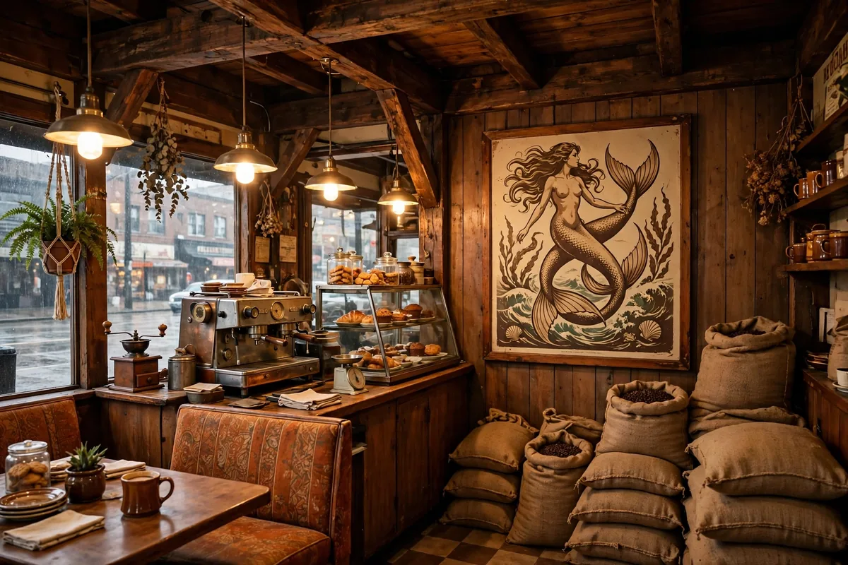
Next time you’re waiting for your latte, take a look at the cup. That green circle with the long-haired woman in the middle has been staring back at customers for over fifty years, and most people have no idea what she’s supposed to be. Is she a mermaid? A goddess? Some kind of coffee queen? Honestly, the real story is weirder and more fun than any of those guesses. It involves a dusty old book, a whale-obsessed novel, and one very bold design choice that had to be toned down before Starbucks could go global. I looked into this, and here’s what the Starbucks logo meaning really is, plus why it’s changed four times.
The Starbucks Logo Meaning: She’s a Siren, Not a Mermaid




As an Amazon Associate, MenuPrice earns from qualifying purchases.
Let’s settle the biggest misconception first. The woman on the Starbucks logo is not a mermaid. She’s a siren, a creature from Greek mythology, and more specifically a two-tailed siren, a figure that also shows up in European folklore as the Melusine. That split tail is the giveaway. Mermaids get one tail. This lady gets two, and that detail has survived every single redesign since 1971.
In Greek myth, sirens lured sailors to their doom with enchanting songs. Dark stuff for a coffee cup, right? But the founders saw the parallel immediately. Coffee is seductive. It calls to you in the morning with its smell, and you can’t resist it. The logo was their way of saying the quiet part out loud: this drink will lure you in, and you will be back tomorrow.
Where Did the Starbucks Siren Come From?
Straight from a 16th-century Norse woodcut. When Jerry Baldwin, Zev Siegl and Gordon Bowker were getting ready to open their first coffee shop in Seattle’s Pike Place Market in 1971, they went hunting through old maritime books for a logo. They wanted something that spoke to the seafaring tradition of the early coffee traders, the men who sailed across oceans to haul coffee beans back to port.
They found a woodcut of a twin-tailed siren, and designer Terry Heckler turned it into a logo. Even the name Starbucks came from the sea. It’s the name of the first mate in Moby Dick, Captain Ahab’s right-hand man. The founders were literary types, and the sea was always the theme.
The Original 1971 Starbucks Logo Was Pretty Risqué
Here’s the part that surprises everyone. The 1971 original was a detailed, bare-breasted siren in coffee brown, surrounded by a ring of text that read “Starbucks Coffee, Tea, Spices.” She was anatomically complete, navel and all, with her two tails spread wide. It looked like something you’d find carved on the prow of an old sailing ship, which was exactly the point.
It worked fine when Starbucks was one funky shop in Seattle. But as the company started putting that logo on delivery trucks and storefronts in more conservative towns, the nudity became a problem. People complained. A topless sea creature is a tough sell in suburbia.
Why Is the Starbucks Logo Green?
In 1987, Howard Schultz bought Starbucks and merged it with his own coffeehouse company, Il Giornale. The logo got its biggest makeover yet. Brown was out, and a fresh Kelly green was in. Green meant growth, prosperity and a clean new start.
The siren got a makeover too. Her bare chest was modestly covered by her own flowing hair, the artwork got smoother and more stylized, and the text ring was simplified to just “Starbucks Coffee.” The wild sea creature of 1971 was becoming a corporate icon. Five years later, in 1992, the logo was cropped tighter around her face when the company went public, making the design cleaner and easier to print at any size.
Why Did Starbucks Drop Its Name From the Logo in 2011?
For its 40th anniversary in 2011, Starbucks made the boldest move yet. It removed the outer ring, the stars and the word “Starbucks” entirely. The siren, now zoomed in tight on her face, stands completely alone. No name. No “coffee.” Just her.
That’s a power move only a handful of brands can pull off. Apple, Nike and Starbucks can all drop their names because their symbols are recognized everywhere on earth. The 1992 redesign had already started the zoom, cropping the siren from the waist up. The 2011 version finished the job, and the company said it reflected a future beyond coffee, into tea, food and whatever came next.
One fun detail from the 2011 redesign: the siren’s face is deliberately asymmetric. Look closely and the right side of her nose is slightly different from the left. The designers said it made her feel more human and less like a perfect robot. People noticed immediately and argued about it online for weeks.
❓ Frequently Asked Questions
What is the Starbucks logo supposed to be?
It’s a twin-tailed siren from Greek mythology, sometimes called a Melusine in European folklore. The founders chose her in 1971 as a symbol of coffee’s seductive, irresistible appeal, and of Seattle’s maritime heritage.
Why is the Starbucks logo a mermaid?
She’s technically not a mermaid, she’s a siren. The difference is the two tails. Mermaids have one. The twin-tailed siren came from a 16th-century Norse woodcut the founders found while designing the brand in 1971.
What did the original Starbucks logo look like?
The 1971 original was a coffee-brown, bare-breasted twin-tailed siren inside a ring reading “Starbucks Coffee, Tea, Spices.” It was redrawn in 1987 (green, chest covered), cropped tighter in 1992, and went wordless in 2011.
Why did Starbucks remove its name from the logo in 2011?
For the company’s 40th anniversary, the brand decided the siren was recognizable enough to stand alone, joining the tiny club of companies like Apple and Nike that need no name on their mark.
So the next time someone asks you about the Starbucks logo meaning, you’ve got the whole saga: a Norse woodcut, a topless 1970s siren, a green 1980s makeover and one confident 2011 bet that paid off. Not bad for a little coffee shop from Pike Place Market.